Standards & Best Practices
Much of the committee's views around design, chart selection, visual cues, and functionality are derived from Tableau's resource guide. The guidebook provides useful information on the selection of the correct chart type for the type of data being displayed, visual guidelines, and functionality. Beyond this the committee has established the following standards and best practices:
Many of the standards in this guide can be found in the standards dashboard. The resources needed to utilize these standards such as icons, art assets, and preferences files can be found on the standards committee’s resources page.
Headers & Footers
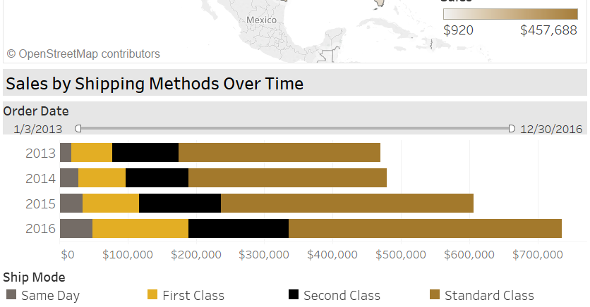
Allow the website wrapped around the dashboard to serve the purpose of a header. On the dashboard itself a header distracts users from what should be the focal point of the dashboard, the visualization! Instead, use a thin and subtle footer with Purdue branding to indicate that this is a Purdue supported dashboard. You can find that footer in the standard committee's resources page.
Background
Overall background for the dashboard should be shades of white or very light grey. Overall color palette should match Purdue's marketing and media palette (which is encoded in the custom palette on the resource page) and colors should remain ADA compliant. For questions about ADA compliance standards please contact Dean Brusnighan (dabrus@purdue.edu) in Purdue IT.
Filters
Overall page filters should be located on the side of the page and affect all visualizations on the page. Preferably the filters will be on the right side, as we focus on the left side of things first and the initial focal area should always be the visualization when possible. Background colors for the filter should blend appropriately with the page's overall background. Be sure to disable all additional buttons that pop up on filters, such as search, show more/fewer, etc. If the user doesn’t need to (or shouldn’t) be able to do something in a filter then it should be blocked from them.
Optional: If you have many filters, it is possible to build them such that they 'pop out' from the side of the dashboard on a button click, freeing up valuable screen real estate. Contact the committee for a tutorial if you would like to pursue this option. Eventually, a standalone tutorial will be written up on how to do this.
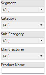
Optional: All page filter selections can be displayed as a footnote on the page and print as a footnote so that anyone viewing the data offline (printed, presentation screen shots) will know what they are filtered to. If you believe your dashboard will be viewed offline often, this is something to consider.

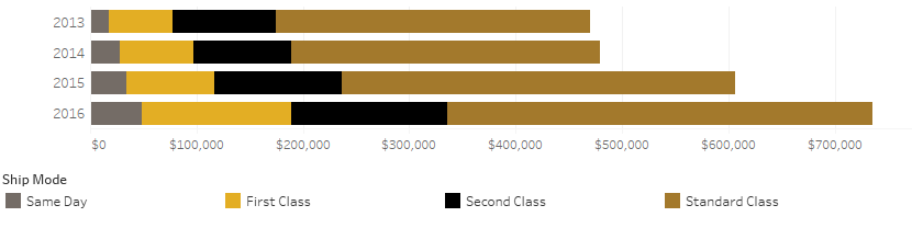
Multiple Visualizations
Titles for individual visualizations on each dashboard should be appropriately distinct and larger than other text. It should be clear that different visualizations under different titles are separate and independent of each other.
Filters that are chart/visualization specific should be centered over the visualization and utilize the same background color as the page filters.
Tooltips
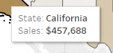
Visualizations should have tooltips associated with them to explain data points when the user hovers over them. Be sure to disable “Include Command Buttons” in your tooltips unless you are absolutely sure you need them.
Help & Metadata
Every dashboard page should have an overall page tooltip explaining the dashboard, providing data definitions for elements, and elements of note on the dashboard. This overall page tool tip should be located on each workbook page under the gray question mark located on our resource page. It should be placed somewhere obvious that is always occupied by white space regardless of dashboard selections.