
Digital Style Guide
Purdue’s digital presence connects with audiences worldwide. A strong, consistent and accessible digital experience ensures every interaction — including websites, emails and social media posts — reflects the university’s standards. The Digital Style Guide provides the framework for creating digital content that is clear, usable and unmistakably Purdue.

Compliance
Accessibility, security, privacy and brand alignment are nonnegotiable. Centralized standards point to Web Accessibility, Our Brand, Secure Purdue and Data Governance, making expectations clear for every site owner. A disciplined approach to compliance demonstrates Purdue’s responsibility to its audiences.
Design and Copy
Design and copy choices carry the Purdue voice online. Editorial standards, voice and tone guidance, AI content parameters, and licensed brand fonts with tested color formulas ensure digital content is clear, accessible and aligned. When every detail — from headlines to buttons — expresses the brand, content is elevated and trust is built in Purdue.
Photo and Video
Images and video capture attention and tell stories that words alone cannot. Specifications for file sizes, responsive cropping and accessibility requirements like alt text and captions keep media optimized for performance. Purdue photo galleries, b-roll and production services provide high-quality visuals that strengthen storytelling.
Metadata and Social Media
Strong metadata and social practices influence how Purdue content appears across search engines and social platforms. Standards cover SEO and GEO, metadata entry in Cascade and WordPress, and platform-specific guidance for social publishing with accessibility in mind.
Blocks
The library of Purdue-designed blocks brings consistency and efficiency to web building in Cascade and WordPress. Each includes image dimensions, character limits, configuration options and accessibility expectations.

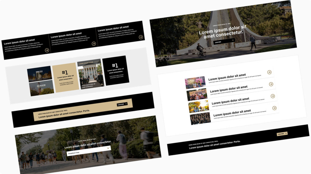
CTA blocks focus user attention on specific next steps such as applying, registering, donating or exploring more content. They use concise copy, strong design and clear links to guide audiences toward high-value actions. These components are most effective when deployed intentionally to support measurable outcomes.

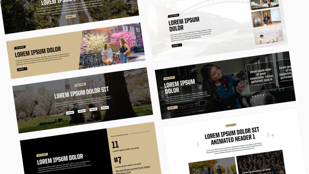
Hero blocks carry the page’s H1 header and establish the strongest presence. They combine bold imagery, direct headlines and clear actions to set user expectations from the start. Because they define page hierarchy and brand tone, heroes should be used once per page and crafted with care for both accessibility and search visibility.

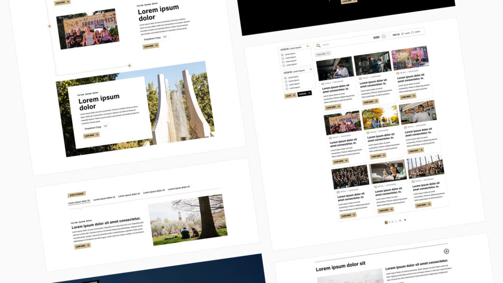
Interactive blocks allow users to explore complex information without overwhelming the page. Accordions, tabs, carousels and hot spots reveal content progressively, keeping layouts clean while offering depth on demand. Used thoughtfully, these components improve clarity, reduce clutter and keep users engaged.

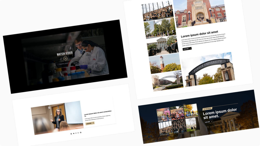
Media blocks showcase photography, video and social content at scale. They emphasize quality visuals while optimizing performance and accessibility across devices. These components bring energy and engagement to a page and help audiences connect visually with Purdue’s stories.

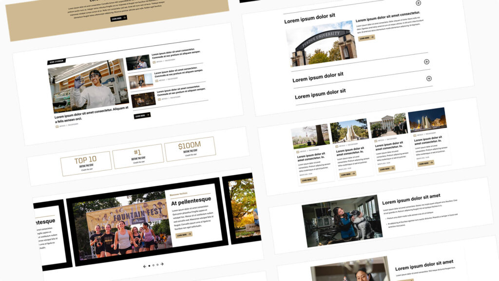
Content blocks organize and present text, images and links in consistent, readable formats. They support storytelling, program details and news in ways that align with Purdue’s digital standards. As the most frequently used category, these blocks balance flexibility with structure, ensuring information remains clear and user-friendly.

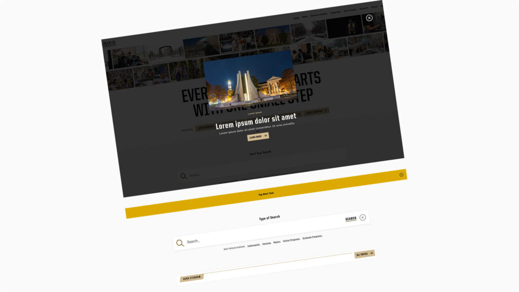
Utility blocks deliver functions that support navigation, orientation and important updates. Elements such as search bars, alerts, quick links and validation messages help users find what they need quickly and respond to information. While not always the focal point, these blocks are essential to usability.
Questions or need a review?
Purdue Brand Studio can provide guidance and support for your web project.