Boilermaker Gold
#CFB991
Strong first impressions and long-lasting recognition are both driven by our visual identity. These elements are how we connect with audiences before a word is spoken or read.
Purdue’s typography communicates clearly and cleanly, with enough flexibility in its consistent font selections for a wide range of situations and applications.
Acumin Pro and Source Serif Pro
These fonts are part of Adobe and can be activated by any user with a Creative Cloud account. Visit Adobe’s support site for details.
United Sans
Marketing has licensed this font for use on any faculty/staff computer owned by Purdue. To install the font on MAC or PC:
After completing the checkout process, you will receive an email with the download link. PC users need to unzip the downloaded zip archive and select the fonts you wish to install. Right-click on the selections and click on install in the pop-up menu. Mac users need to unzip the downloaded zip archive and use Apple’s FontBook application to import the fonts.
This sans serif design works well for headlines, subheads, callouts and body copy. Use Acumin Pro, Acumin Pro SemiCondensed or Acumin Pro Condensed.
A more rigid, collegiate look is conveyed with this display typeface that’s best for brief callouts, factoids and numbers and for adding emphasis.
Our designated serif family is used for small sizes and longer-form text, as well as more sophisticated applications.
Typefaces may not always be available depending on the digital application. If needed, use the following alternate fonts:
See the Brand Guidelines for more information on leading, tracking and typography, plus helpful tips and tricks.
Download the Brand Guidelines for more information on color application, accessibility, printed and coated papers, and more.
Structured and expressive, these visual components move us to the next step of our discovery. In this way, they reflect the work we do every day. See the Brand Guidelines for information on all of our graphic elements, including border frames, vertical rules and emphasis boxes.
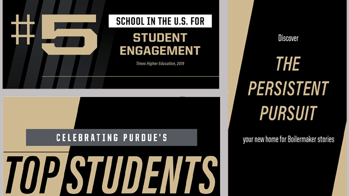
In the absence of imagery, color blocking can be used to convey movement when used in a diagonal swipe. Colors can be used individually or paired.
For most diagonal band applications, we recommend an angle of 77 degrees, which matches the incline of the italic style of Acumin Pro.

On oversized headlines, an outlined-type highlight can be applied. Thoughtful consideration should be given to when this is applied, especially at smaller point sizes. The highlight should never impede the legibility of the primary type. The outline thickness will be determined by the scale of the text. Generally, the line weight will be .5 or 1.0 points.

The arrow icon is a visual element intended to subtly guide attention and enhance storytelling. Its primary purpose is placemaking — helping orient the viewer when referencing a specific location, direction or point of interest. Arrows should be used sparingly and intentionally. Overuse diminishes their impact and disrupts the visual clarity of our design system. When used well, they add emphasis and movement without overpowering the core message. These arrows can be used in text to mark, direct or link various compositional elements.
Colors: gold, gray, black and white
The width of the arrow should be kept consistent across usages.
Avoid using the arrow as a decorative element or in contexts that do not serve a clear directional or locational function.
Explore the Creative Content Library to see graphic elements and other visual brand components in action.

Discover Our Brand Guidelines