
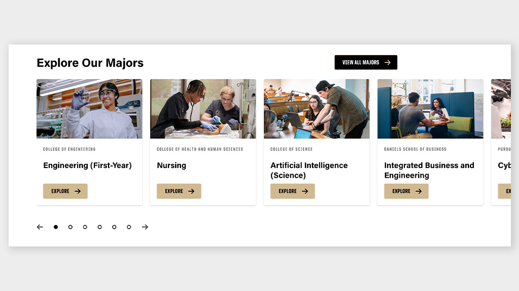
| Category | CMS |
|---|---|
| Post/Content | Cascade, WordPress |
Instructions
Options:
- Type of the source: manually enter, RSS
- Card type: story card, faculty card, simple card, list card
- Card background: white, black, gray
- Include excerpt on the card: checkbox
- Include thumbnail image on the card: checkbox
- Feed URL: URL
- Add post type tag on the cards: checkbox
- Add category tag on the cards: checkbox
- Header of this section: text
- Choose layout: grid, slider
- Number of columns shown on desktop: one, two, three, four
- Change card layout to horizontal: checkbox
- Loop the slides: checkbox
- Link text to this section: text
- Link URL to this section: URL
- Open link in new tab: checkbox
- Choose the background: none, gold, black, gray
- Choose header background color: gold, black
- Padding at the top: none, small, medium, large
- Padding at the bottom: none, small, medium, large
- Remove side padding: checkbox
Cards:
- Story card:
- Card background: white, black, gray
- Include excerpt on the card: checkbox
- Include thumbnail image on the card: checkbox
- Card image: media
- Optional post type tag: text
- Taxonomy tag: text
- Title: text
- Subtext: Text area
- Card link text: text
- Card link URL: URL
- Button CSS class: text
- Open link in new tab: checkbox
- Card link two text: text
- Card link two URL: URL
- Open link two in new tab: checkbox
- Button CSS class two: text
- Faculty card:
- Card image: media
- Faculty name: text
- Faculty title: text
- Faculty title line two: text
- Email: text
- Address: text
- Office phone: text
- Cell phone: text
- Home phone: text
- Website link text: text
- Website URL: URL
- Open website link in new tab: checkbox
- Simple card:
- Card image: media
- Title: text
- Subtext: text area
- Card link text: text
- Card link URL: URL
- Button CSS class: text
- Open link in new tab: checkbox
- Card link two text: text
- Card link two URL: URL
- Open link two in new tab: checkbox
- Button CSS class two:text
- List card:
- Content: InnerBlocks (purdue/link-cards-single)
- Card background: white, black, gray
Card fields: managed inside nested “link cards single” blocks in the editor
HTML anchor: text
Note: Cards can be manually added or pulled dynamically from an RSS feed.
Heading: max 40 characters
Story card image size: 712 x 400 px (16:9)
Faculty card image size: 272 x 727 px (1:1)
Features not included in Cascade:
- Simple card, list card
- Padding
Cascade only:
- Number of cards: six, eight, nine, 10
Faculty card:
- No options for website URL, cell or home phone, only a generic phone field.
- WYSIWYG editor for custom content
Story card:
- No card background option.
- Excerpt is subtext in Cascade and only a text field.
- Image is required.
- Only one button allowed per card.
Live Block
Example 1 of 4
header




Example 2 of 4


Example 3 of 4
Example 4 of 4
Title
Body Copy
Title
Body Copy
Title
Body copy