How do I check to see if my content on Brightspace is accessible?
When creating content for your Brightspace course, it’s good to take steps to make sure your content is accessible to all learners. Here are some tips to keep in mind when creating content.
The Accessibility Checker
Whenever you use the HTML editor, be sure to run the accessibility checker on the top tool bar after you are done writing your content description. You may have to click the three dots in the upper right corner to expand the tool bar. If you hover your mouse over each tool, the tool label will appear giving a description of the tool. The accessibility checker will walk you through any accessibility issues and how to fix them.
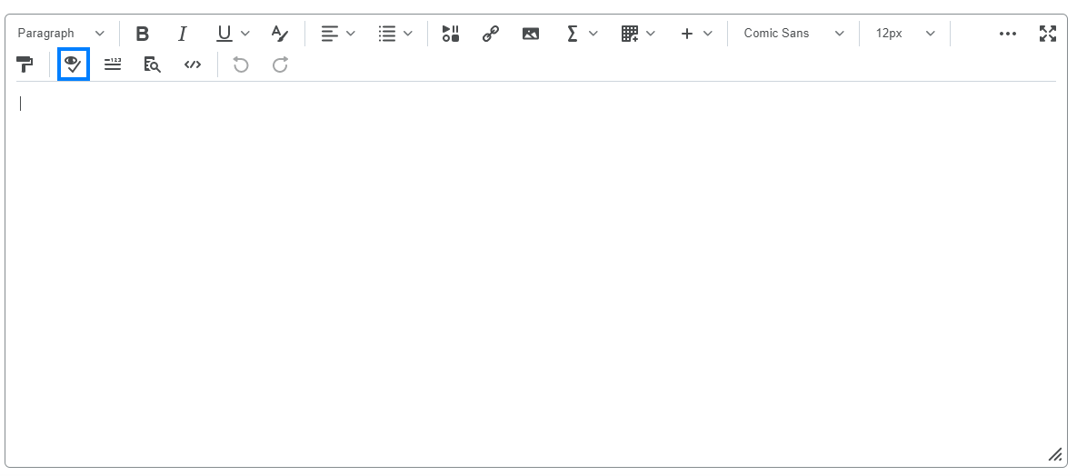
Keep in mind, though, that the accessibility checker can’t catch every accessibility issue. It’s best used as a quick guide to check accessibility, but it does not guarantee that there are no issues.
Headings
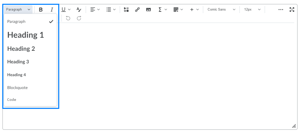
Headings are a convenient way to organize your content, and they’re also great for accessibility. Learners who use screen readers can utilize headings as a simple means of navigating through large sections of text. Headings should be concise and not overused, and they must be nested properly. Heading 1 is the “highest level” heading; it’s good for titles. Heading 2 is for subtopics, Heading 3 is for sub-subtopics, and so on.
In Brightspace’s HTML editor, you can select different headings by clicking the dropdown menu next to “Paragraph,” in the upper left corner.
Alternate Text
Learners who use screen readers rely on alternate text to describe visual elements of a document to them. Alternate text (also called alt text) should be a concise description of an image, video, and other forms of media.
When you upload an image to Brightspace using the HTML editor, this dialog will appear:
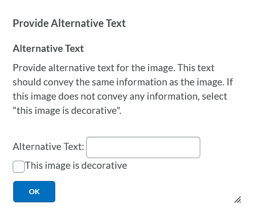
Simply type the alternative text in the provided box. Or, if the image is purely decorative, select “This image is decorative,” and screen readers will ignore the image.
Something to keep in mind when writing alt text is that a screen reader will tell the learner when it has reached an image. Because of this, it’s redundant to include phrases like “A picture of” or “An image of” in your alt text descriptions. Instead of writing “A picture of a tree,” you can simply write “A tree.” For more information on writing alt text, visit Microsoft’s guide to writing effective alternative text.
Lists
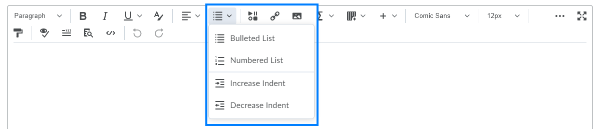
When making lists, always use the list option included in the HTML editor tool bar, rather than asterisks, dashes, or other “unofficial” means. This is important because screen readers can identify and tell learners when a “real” list is being read, but it can’t identify lists that weren’t created using built-in features of text editors. Using the list option in Brightspace is the best way to avoid confusion.
Links
If you would like to include a link in your Brightspace content, be sure to add a title along with the link. To do this, simply use the link option in the HTML editor, and select “URL” or another preferred link type. This dialog will appear:
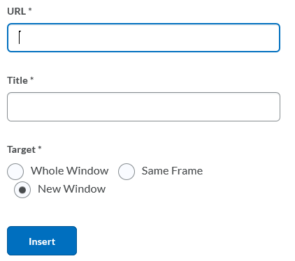
Paste your link in the URL box, then add a concise title describing the content being linked. Titles are important because listening to a web address being read from a screen reader can be both grating on the ears and difficult to comprehend. If a title is included, the screen reader will let the learner know that a link is being read, then read the title of it.
Tables
Always use built-in features to create tables in text editors. Although it may seem easier to simply use tabs or spaces to create a “makeshift” table, this can be very confusing to learners using screen readers. They will not be able to navigate through different cells, identify headings, or read a summary of the table. Tables created with built-in features are much easier to navigate and understand.

Other Tips
- The only text that you should underline is links. This is because learners with visual disabilities may confuse underlined text for a link. Alternative options for emphasizing text are bold, italics, and headings.
- Make sure that all text strongly contrasts with the background. Yellow text on a white background, for example, would be difficult for learners with visual disabilities to read.
- Include closed captions for all audio and video.
- Use Sans Serif fonts that are easy to read, as character fonts can be difficult for some learners to interpret.
- Avoid using abbreviations in text (such as “ex” for “example” or “vs” for “versus”). Screen readers can’t interpret these abbreviations, which may cause confusion to learners. However, abbreviations commonly used in speech, such as “USA” or “NASA,” should be fine.
Last Updated: 1/8/2022